I Help Businesses Turn Data Chaos into Clarity
Power BI, Excel, Looker, Google Sheets & SQL Specialist – Delivering Clean, Interactive Dashboards That Simplify Your Data

VIKAS KASHYAP
FREELANCE DATA ANALYST
My Projects
Explore my interactive and dynamic dashboards and insightful data reports.
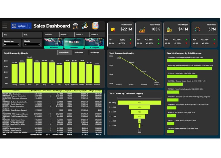
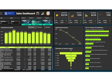
📦 Logistics Sales & Inventory Dashboard
Built for Set Logistics (USA) to track real-time sales, inventory flow, and operational KPIs
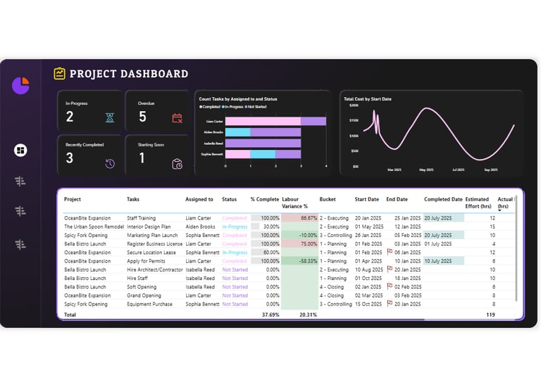
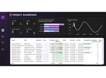
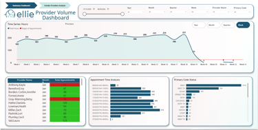
📁Project Management Dashboard
Interactive Power BI dashboard to monitor tasks, deadlines, team workload, and project health in real-time

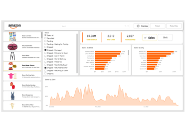
🛒 Amazon Sales Performance Dashboard
Track revenue, ROI, top-selling products, and regional trends with dynamic Power BI visuals
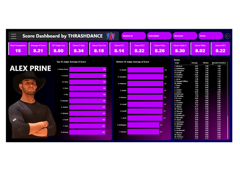
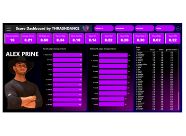
🏆 Athlete Performance Analytics Dashboard
Compare scores across locations and judges to identify strengths, biases, and improvement areas
Work Experience
With over 5 years of experience as a Data Analyst and Data Visualization Engineer, I specialize in creating impactful dashboards using Power BI, Looker, Excel. I've worked with diverse data sources—including Excel, CSV, Google Sheets, JSON, TXT files, as well as cloud platforms like SQL Server, MySQL, Snowflake, Dataverse, and various CRMs—to deliver real-time status tracking, performance monitoring, and deep drill-down insights that drive smarter business decisions.
Expert in Data Visualization, Data Modeling, Data Cleaning, Data Transformation (ETL), and Building Interactive Dashboards & Reports
Experience
Freelance Data Analyst Professional | Data Visualization Engineer | BI Expert
VikasTheAnalyst
2024 - Present
Specialized in creating interactive, dynamic dashboards and actionable analytics using Power BI, Excel, SQL, Looker Studio, and Google Sheets
Data Analyst at Specta
2022 - 2024
Focused on data management and reporting across multiple platforms and tools.


Junior Data Analyst at Accenture
As a Data Analyst(Remote) at Accenture, I employed a diverse skill set including Excel, VBA, Power BI, Data Modeling, and Power Query. My role involved analyzing complex datasets, generating insights, and presenting findings to support strategic decision-making. I contributed to optimizing processes and enhancing data-driven solutions to meet organizational objectives.
2020 - 2022

Gallery
Explore my interactive dashboards and insightful reports showcasing analytics.

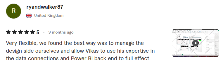
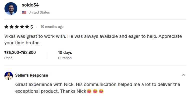
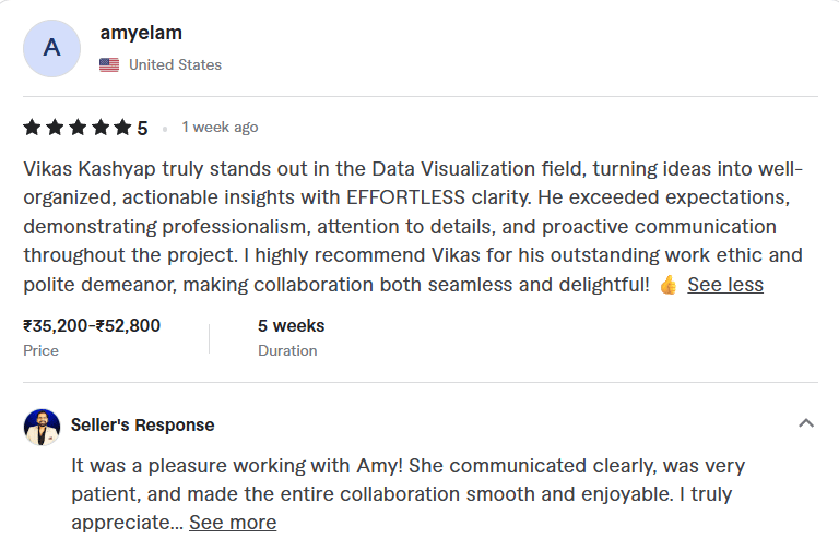
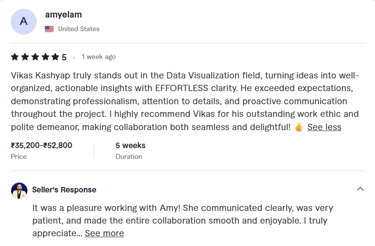
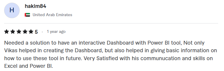
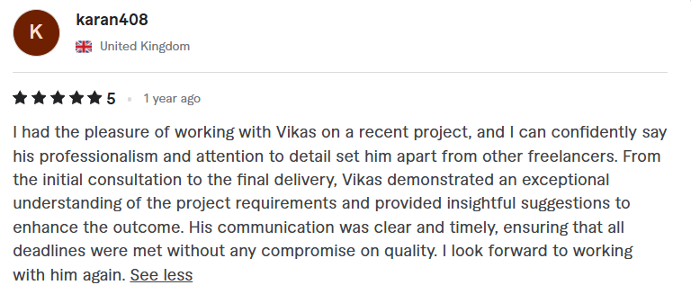
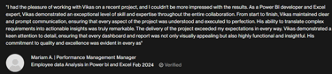
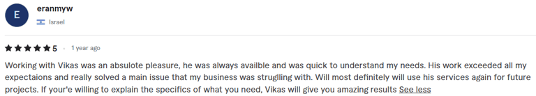
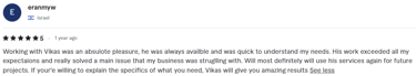
Clients Reviews
Discover what our clients think about our service